A library of C# scripts and visual templates to streamline adding custom SVG visuals to Power BI reports.
In Power BI there are many options to create custom visuals for your reports. An increasingly popular technique is to create DAX measures that contain a dynamic SVG specification. These “SVG measures” render as small microvisualizations in certain visuals like tables, matrixes, and the new card visual. These visuals allow for pixel-perfect control and can result in some creative and powerful charts.
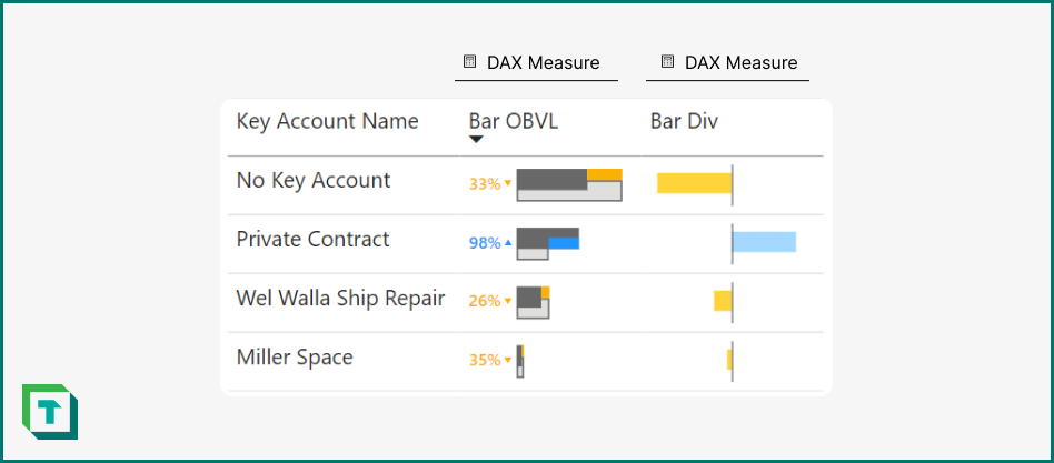
You can see an example of these SVG visuals below:
However, creating these SVG specifications is complex, time-consuming, and prone to error. Furthermore, these measures can be a burden for the semantic model; if they aren’t placed in separate tables and display folders, users might confuse them with proper model measures.
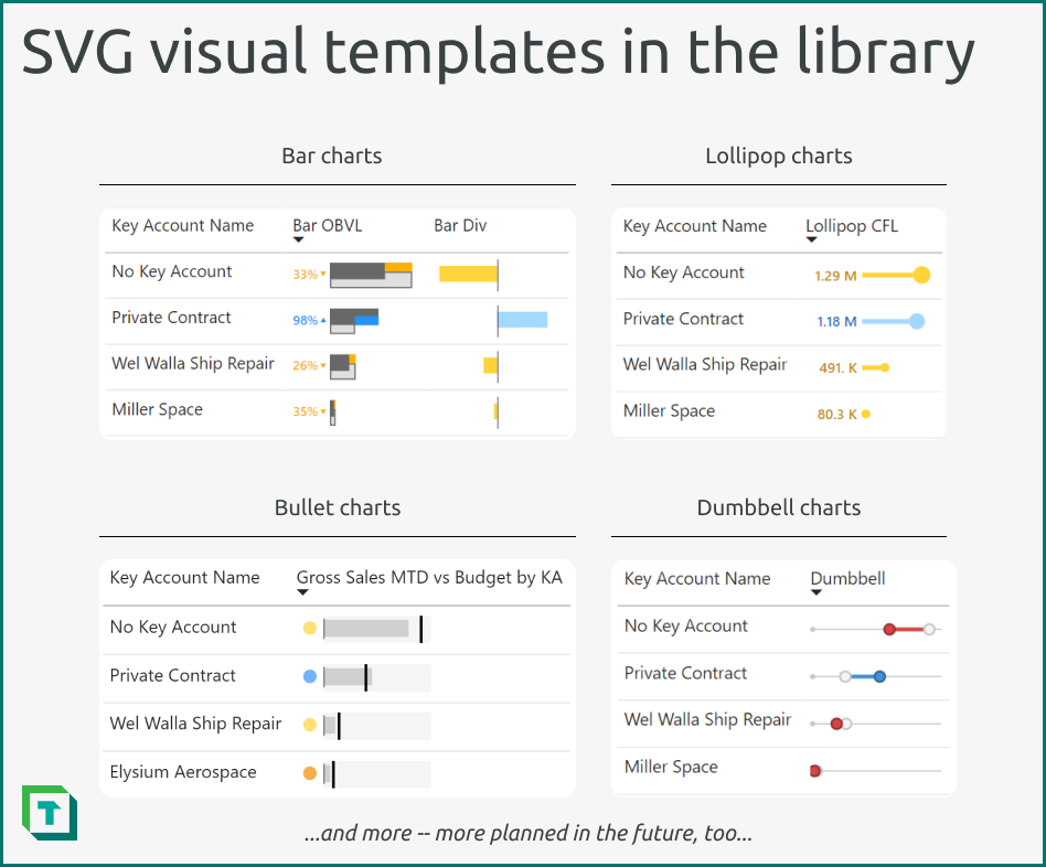
To mitigate these costs, many in the Power BI community have shared their own SVG visual templates, but those less experienced in Power BI or in dealing with SVGs might struggle to implement these templates in their own work. To help with this, we’ve created a library of C# scripts to streamline the implementation of these templates. This library includes over two dozen original visual designs that you can use in your own Power BI reports.
How to use these scripts
These scripts are provided as a “plug-and-play” solution, where anyone can use them from Tabular Editor 2 or Tabular Editor 3. To use them, simply follow the instructions below:
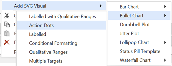
- Navigate to the library and copy the script for the chart template you want to use. Ensure that you apply the correct chart type for your scenario.
- In Tabular Editor, connect to your model and select a table where you want to add the measure. This can be a local model open in Power BI Desktop or a remote model in a PPU or Fabric workspace.
- Paste the script in a new “C# Script” window. Run the script while selecting a table where you want the measure to be inserted.
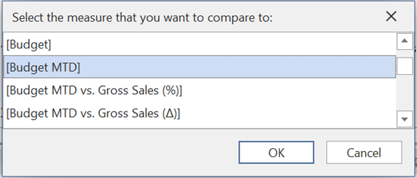
- Follow the instructions in the script to select the fields to use in the visual. Note that you can only add fields that are not hidden; you will need to un-hide any hidden fields that you want to use.
- The script will make the measure, including:
- Adding the DAX code.
- Creating the measure.
- Setting measure properties, like DataCategory and Description.
- Organizes the measure into folders to segregate it away from the “rest” of the semantic model.
- Validate the measure DAX and the SVG specification (if necessary), then re-name the measure, appropriately.
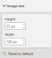
- In the Power BI report connected to the model, create a new table visual. Add the “Group by” column (that you selected in the script) to the table, and format the visual. During this formatting, set the “Image size” property to the recommended values for the template (typically ‘Height’ of 25px and ‘Width’ of 100px). Note that the visuals are designed to work with a table, but might also work with matrixes or the new card visual; however, you might need to make minor adjustments for the latter.
- Test the visual in different filter contexts to ensure it behaves as expected, doesn’t contain errors, and doesn’t have any performance issues.
- (Optional) Add the scripts for your favourite visual templates to your Tabular Editor macros. That way, you can implement it at the push of a button whenever you want.
In conclusion
We hope that these C# scripts and SVG visual templates can help you to improve your reports. Creating and using templates for your data models and reports is an important step to not only improve your productivity but also can help improve the maturity of your team and organization in reporting. One way to do this is by using C# scripts in Tabular Editor, which are beneficial not only for creating data models, but also visuals.